| bucket | activity |
|---|---|
| charitable/organisational | benefactor to ~ founded ~ fundraiser for |
| collections | curated (item) ~ donor to ~ loaner to ~ recovered (free text) ~ seller to ~ was collector of ~ was donor of |
| education | educated at |
| elections | election to Council of CAS proposed by ~ election to RAI proposed by ~ election to SAL proposed by ~ proposed election to RHS signed by (personal) |
| event participation | attended ~ exhibited at ~ organiser of ~ performed at ~ spoke at ~ was delegate at (free text) ~ was delegate at (item) |
| fieldwork | director of archaeological fieldwork ~ director of expedition ~ Member of Committee for Archaeological Fieldwork ~ member of excavation during archaeological fieldwork ~ member of expedition ~ President of Committee for Archaeological Fieldwork ~ travelled overseas for |
| positions | acknowledged for role ~ applicant to ~ employed as ~ held position ~ held position (free text) ~ served on |
| publishing | contributed to ~ illustrated in ~ work(s) published in |
| societies | corresponded with ~ was fellow of ~ was member of |
PPAs and change over time
Wikibase queries
- Dates section
- PPA buckets
Notes
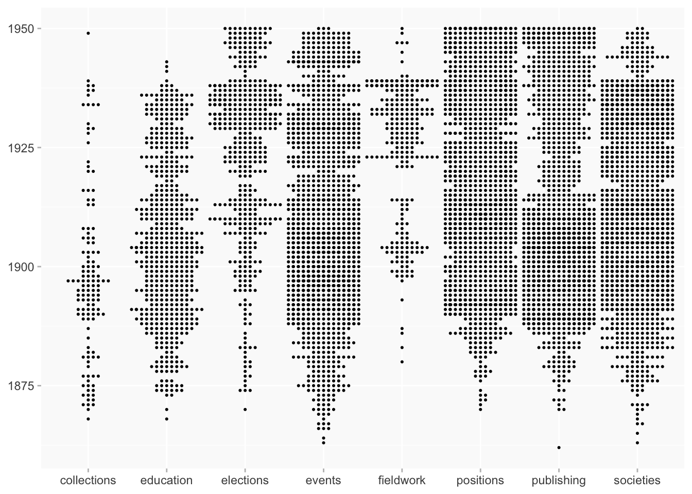
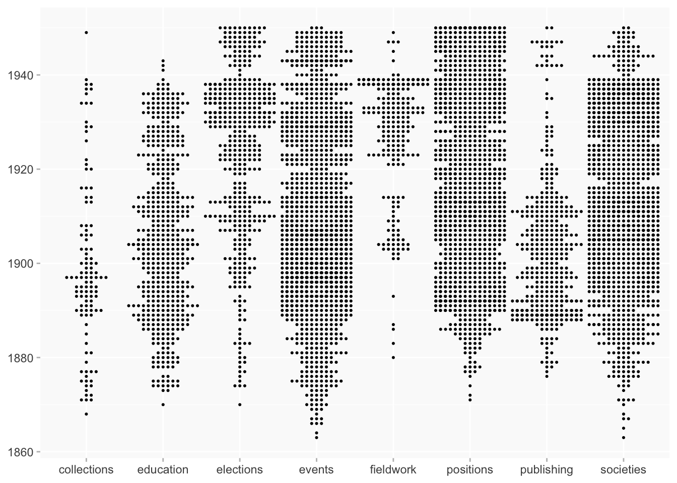
Can you make a bee swarm-type diagram that plots the frequency of PPAs across all the women in the dataset, across the entire project period? So with years ascending up the y axis, and all the women considered one big blotchy group (am sure that’s the technical term). What we want to get is an overview of whether certain kinds of PPA were more dominant at various periods of the overall period covered by the project, e.g. women suddenly started doing more excavation or whatnot in the 1910s, whereas before that there was almost no excavation activity associated with women. Project data on PPAs still very incomplete for post-1920s period, at least until CAS Earthworks and Blue Paper data is fully added, but even if we could begin to get a sense for the 1870 - 1920 period this would be very helpful to us.
- Updated to use the PPA buckets
- I’ve moved the Big Blob versions to the bottom of the page since there was a clear preference for the separated approach!
Overview
The PPA buckets (see also).
Beeswarms
dates
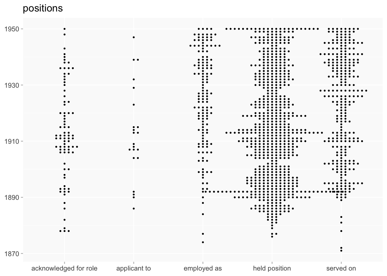
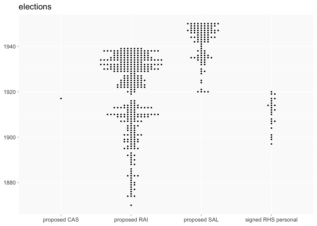
Although it becomes (I think) less effective with very small categories, we can drill down into different properties in a larger category.
in the case of positions, most are held position
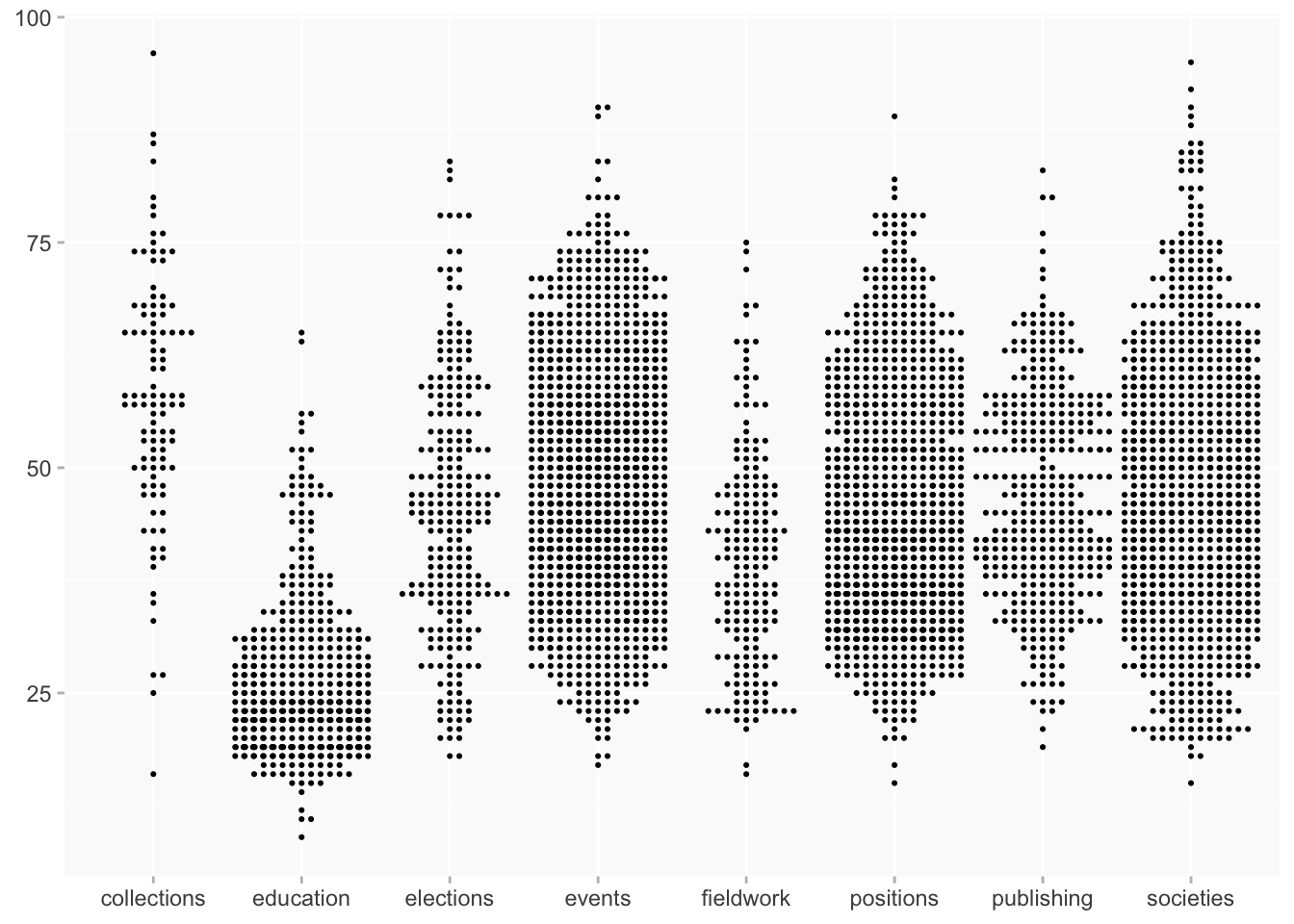
age
age and birth period
This splits the women into age groups; I’ve reintroduced a colour element because the facets are too narrow for the category labels.
playing around with variables
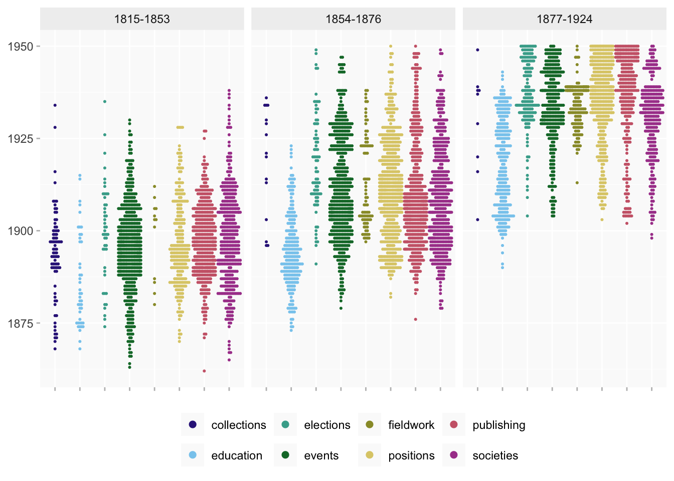
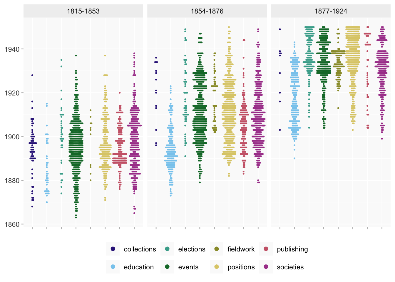
held position
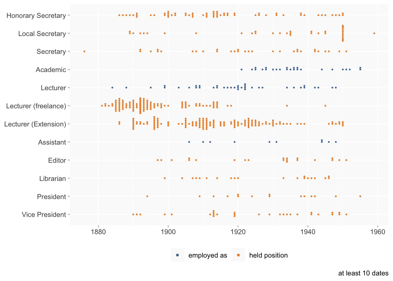
This only shows job titles with at least 10 dates. (I’ve included employed as for the handful that met the threshold.)
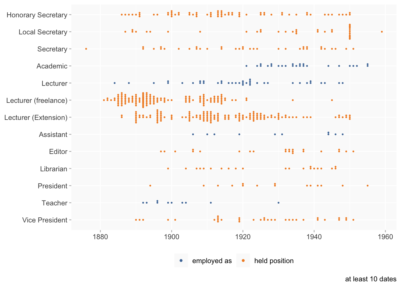
And by age, in birth groups.
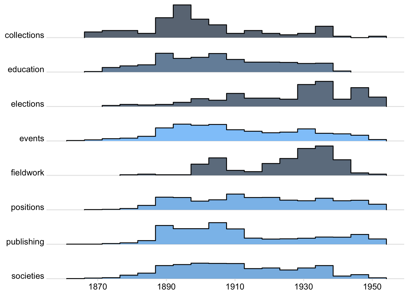
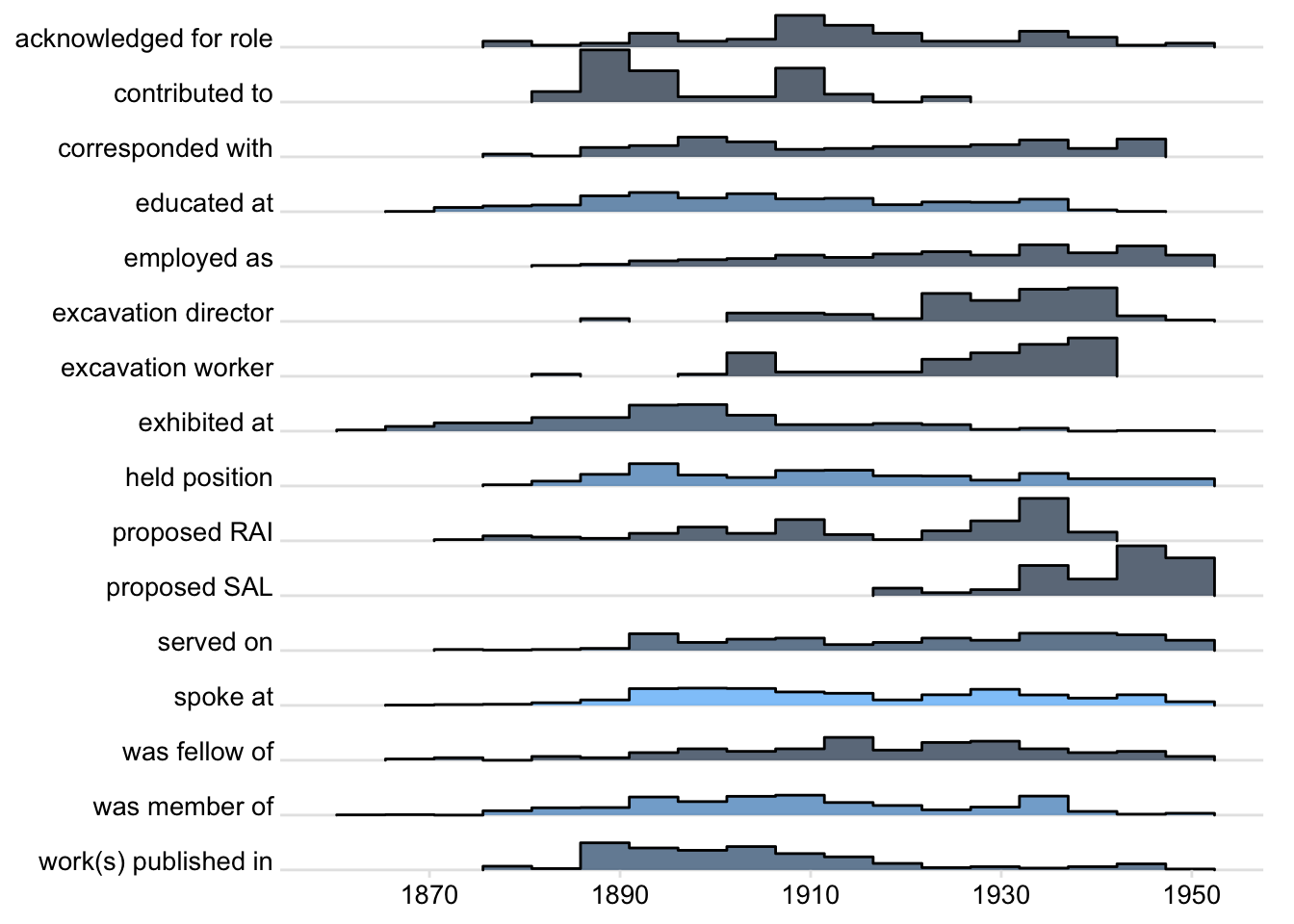
Ridgeline plots
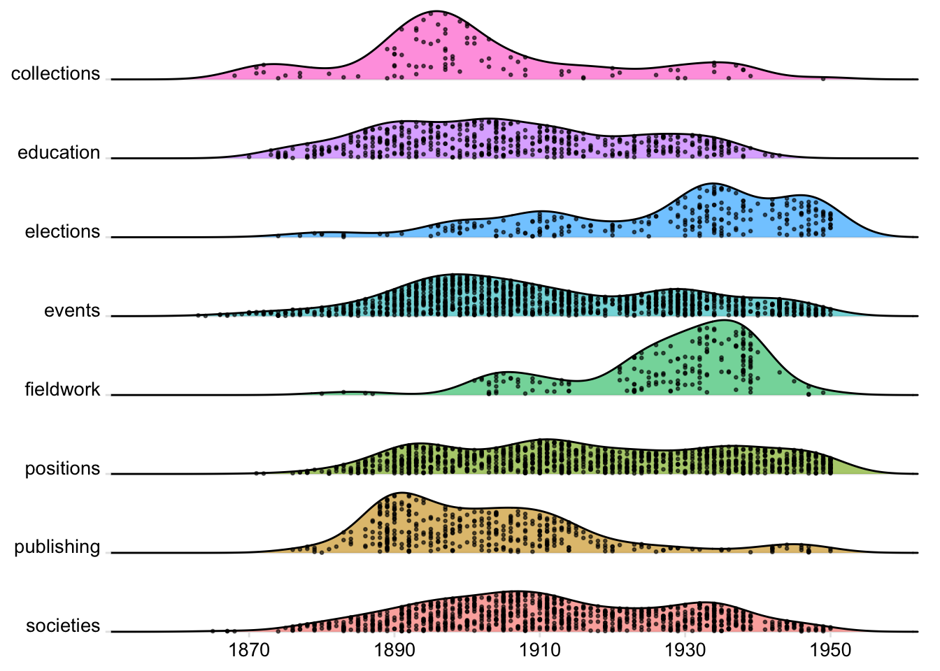
These are another option for this kind of comparison of trends. They’re also not dependent on colour, so it’s not necessary to reduce categories quite so brutally. I’ve included education this time.
They show the proportion of dates (rather than counts) in each “bin” (5?-year-period) for each category. So categories are directly comparable regardless of size (though very small ones can be a bit misleading).
I’ve experimented with using colour as an indication of the size of the category - the lighter the shade of blue the larger the category (but I’ve done it in a really hacky sort of way and would need to fix it properly).
Showing individual properties (with 50+ instances) (some light categorisation might still be useful though, I think)
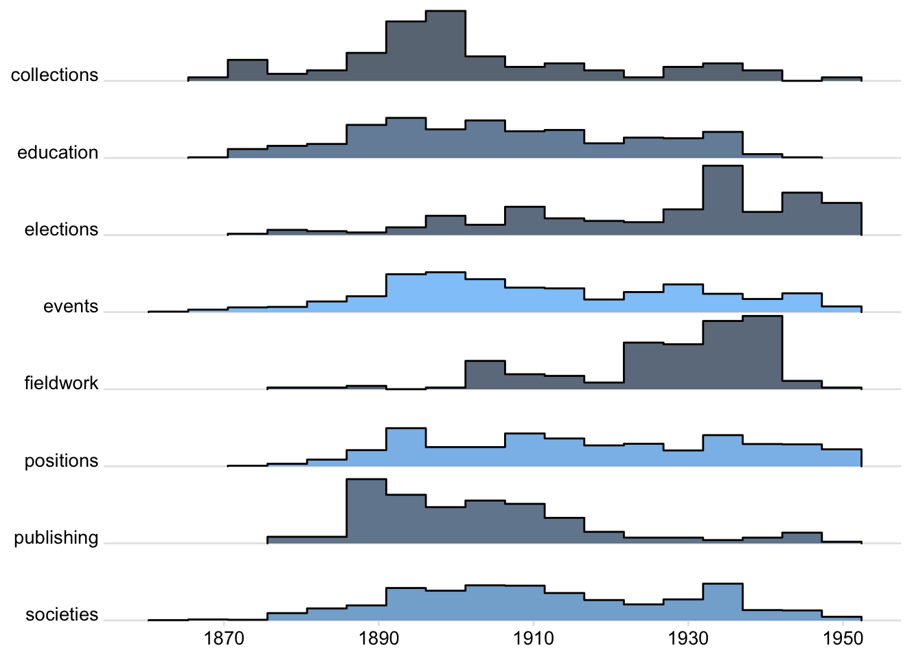
This is a variation on the same theme. The ridgeline shows a smoothed trend line, but this adds the actual distribution of dates as points, so it’s a bit more like the beeswarm. Colours are just for fun this time around.
The Blob
- I’ve flipped the axes for this because it makes better use of space
- It’s quite pretty but I’m not convinced it’s the most effective way to visualise what you want to know
- the focus of the earlier beeswarms was comparison of different groups rather than looking closely within a single blob
- there are so many PPA categories vs how many colours it’s possible to use in one chart
